Print #1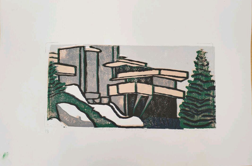 Print #2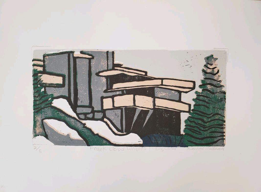 Print #3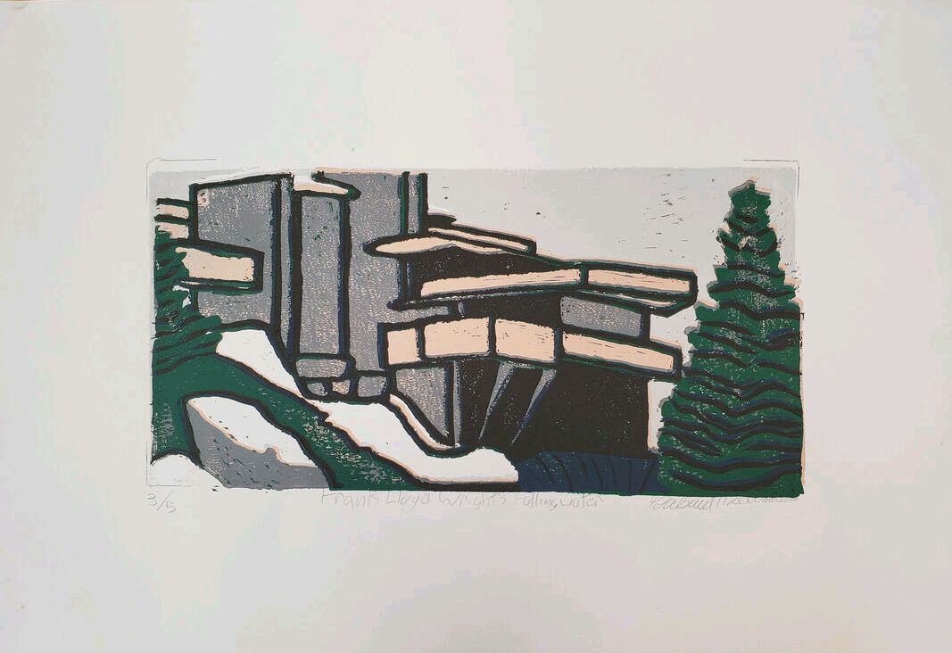 1.) Registration and Carving: I think my registration marks were great. It was as simple as tracing the linoleum so it's hard to misregister. The carving of the linoleum was harder. There were some spots that I could not carve any further, but that was mainly due to rolling issues. As a whole I think I carved pretty well. I don't think I went too deep and the shape is well defined.
Burnishing and Ink Coverage: This is where one of my problems arose. Some of my ink coverings were not very thorough or too thorough, and ended up causing this unwanted texture that looks dotted. Also, I think I pressed the brayer roller too hard causing some of the ink to go into the carved areas and when I pressed it transferred onto the paper. When I pressed the linoleum onto the paper I made sure to press and use my hands to roll the ink onto the paper. Sometimes this didn't quite help. 2.) Texture: I like how I made sure to not leave the trees just green, but I had some black lines going through them and they might be too large, if they were too thin they would just fall apart. I also did the same thing for the dark water and it is supposed to imitate the water falling. The texture defines the trees apart from the straight, orderly building. Color Harmony: Most of my colors worked well together. On one side I had white, light grey, dark grey and black which flow. I also had a sort of "triangle" of colors on the color wheel, although it might be a stretch; tan represents orange, the water represents dark blue and the trees are a shade of green. On a color wheel these 3 colors roughly represent a triangle on the color wheel, which is an example of color harmony. Balance: I purposefully made the bottom left and right more random with flowing shapes and the middle and top left straight and orderly. This both does not put the main focus directly in the middle, creates a balance of entropy and order, and organizes the paper into a couple of sections. 3.) In order to make my print better I should have spent more carefully rolling the brayer and equally painting each section of linoleum. Also, because there is a middle ground of not too much but not too little paint that should be applied to the linoleum, I should have spent more time controlling how much paint I was using to stop the "staticky" look of some parts of the paint.
0 Comments
Leave a Reply. |
AuthorGabriel M. Archives
June 2019
Categories |
 RSS Feed
