Watercolor Tomato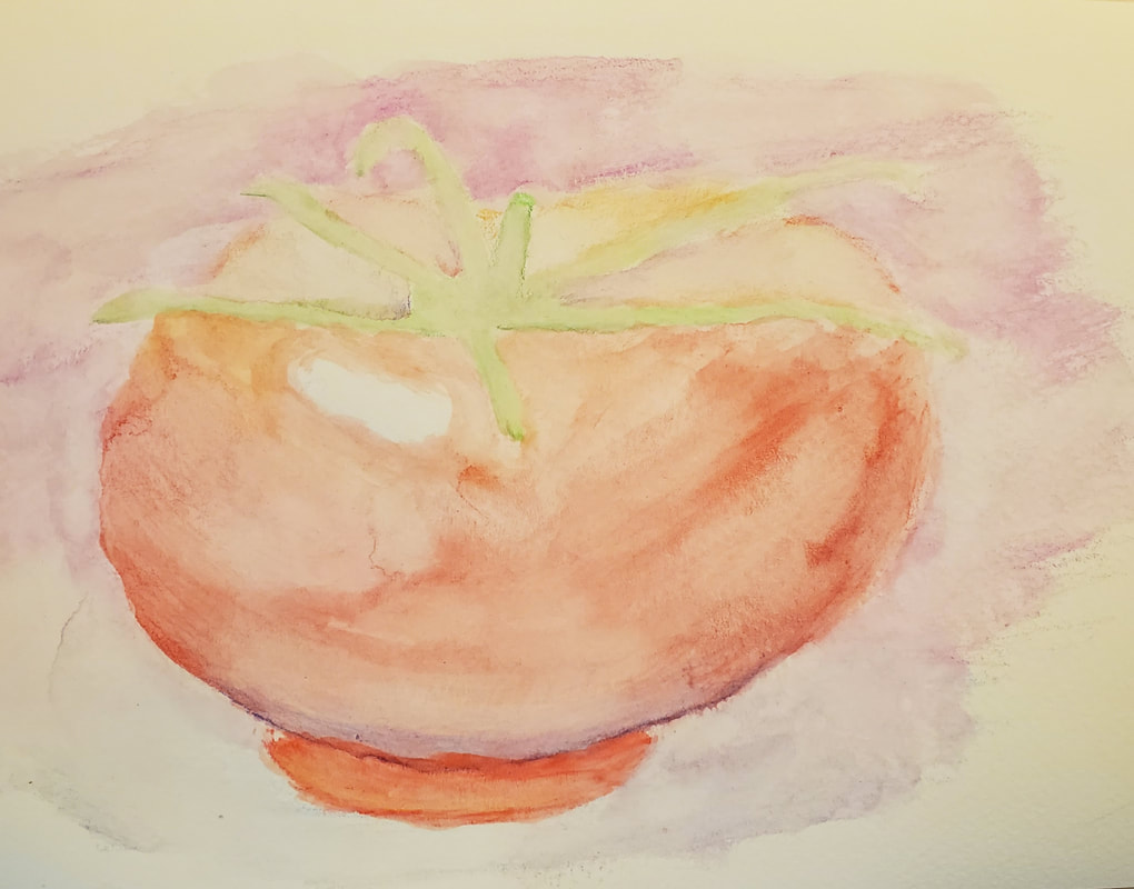 Watercolor was by far the most difficult because of how much the colors blended. Going back over the tomato with more watercolor after it dried tended to leave marks.
Prisma Tomato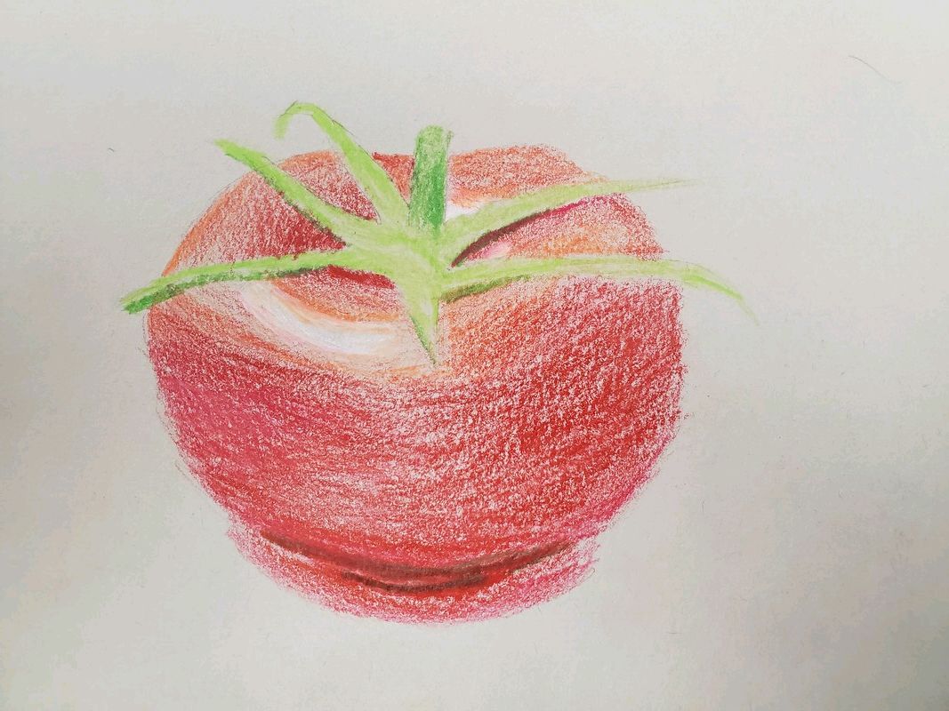 This tomato was done in prismacolor and was challenging mixing the colors.
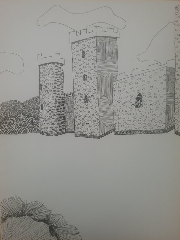
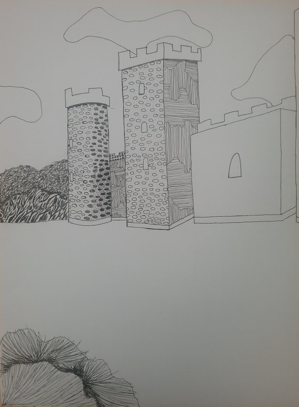
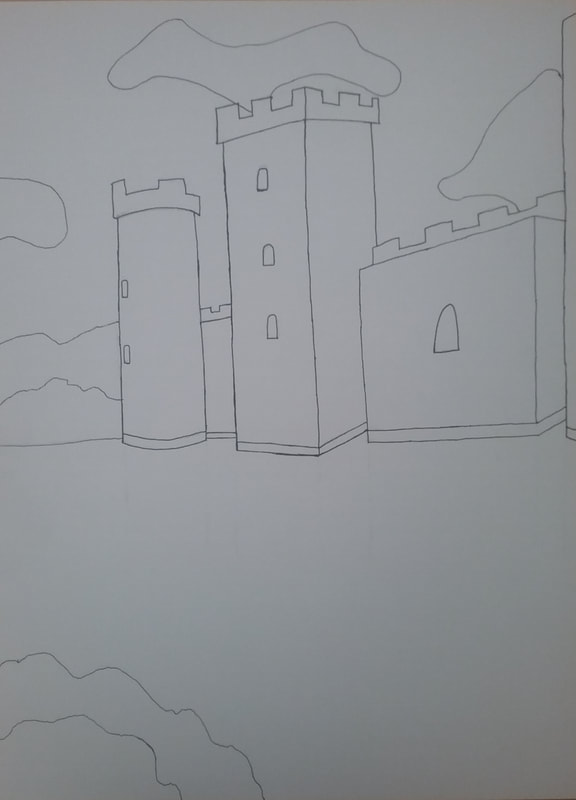
20 Ideas Reference Pictures Composition Sketches Final Piece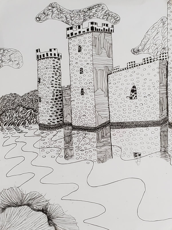 Critique Questions1. I arranged my castle to not be in the center, and have many different sections on different layers. I think that my composition was a success, especially because it follows the rule that there isn't anything perfectly in the center.
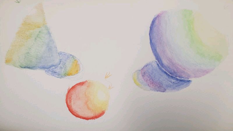
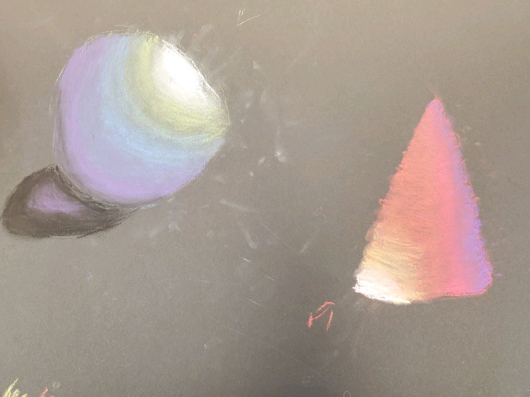
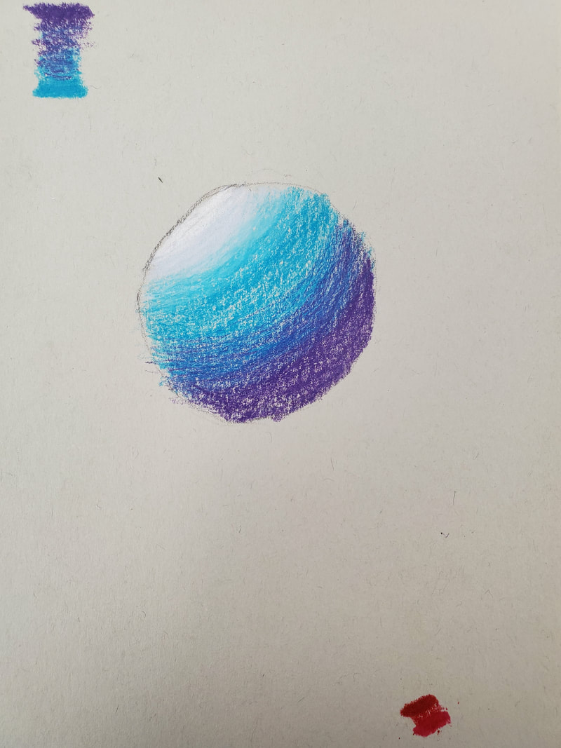
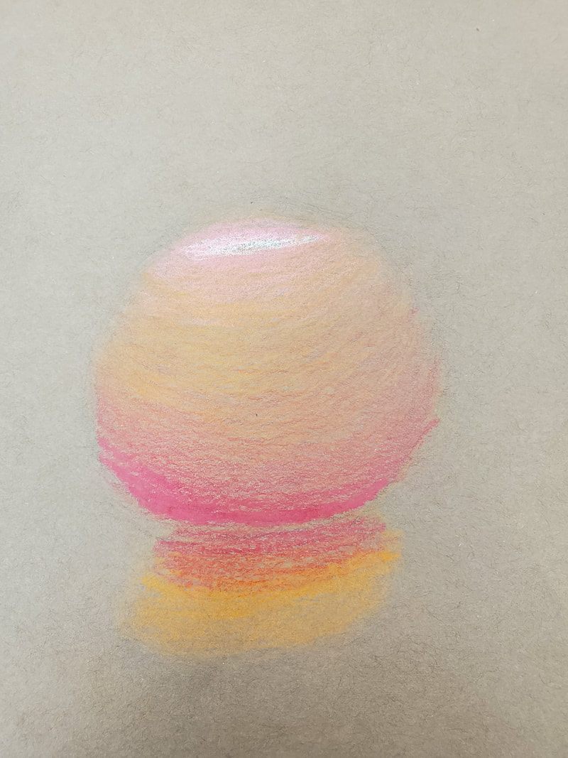
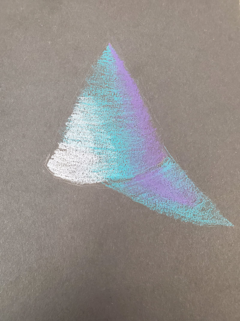
2. The texture and pattern is important in my final because it displays what is further and closer to the viewer. For example, you can tell that the bushes on the far left are further behind. Likewise, you can see that the water waves are closer together towards the horizon and much open towards the viewer. 3. Value is important because it also shows the depth, more specifically it shows some shadow, like when the main wall is over top the main tower. Similarly, when looking at the grass at the bottom right, you can tell that the lighter grass is in front of the darker grass in the back. 4. The craftsmanship on this piece is pretty good. I can see where I need to improve, like some of the shading in between some of the stones on the towers' foreground. 5. I learned how to create different patters of different value to convey depth and composition. I also learned how to use stippling in between pattern to make the area darker. 6. If I didn't learn this in class, and I was just told to make something in pen, it would have turned out flat and bland. From learning and applying in class, I have created something more interesting to look at with more depth. 7. I think that learning how to shade between objects further and closer to make one pop is a very important skill to have for the future. Almost all art projects have depth, and are not flat. 8. To enhance my final outcome I would have to redo the shadow on the left-most tower because it looks much different from the rest of the stone pattern. I would also make sure not to have some lines intersect, like for example in the waves. You can tell I went over pen with pen, and it looks strange, however pen is unforgiving, and I can't go back and erase it. A final thing is darken up the sides of the towers and walls to make sure the viewer can tell the difference between depth. Pastel Tomato It was much easier to blend the colors, however getting a dark shade on the bottom without overtaking the entire tomato in purple was difficult.
|
AuthorGabriel M. Archives
June 2019
Categories |
 RSS Feed
