Art 1 Blog
|
|
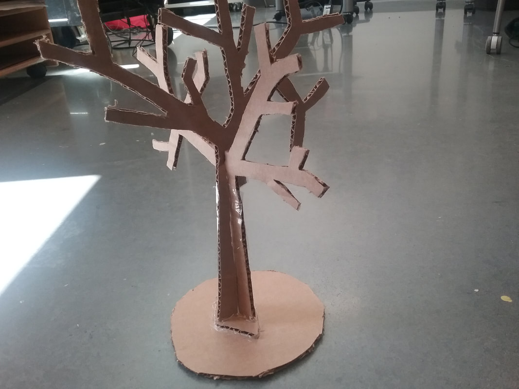
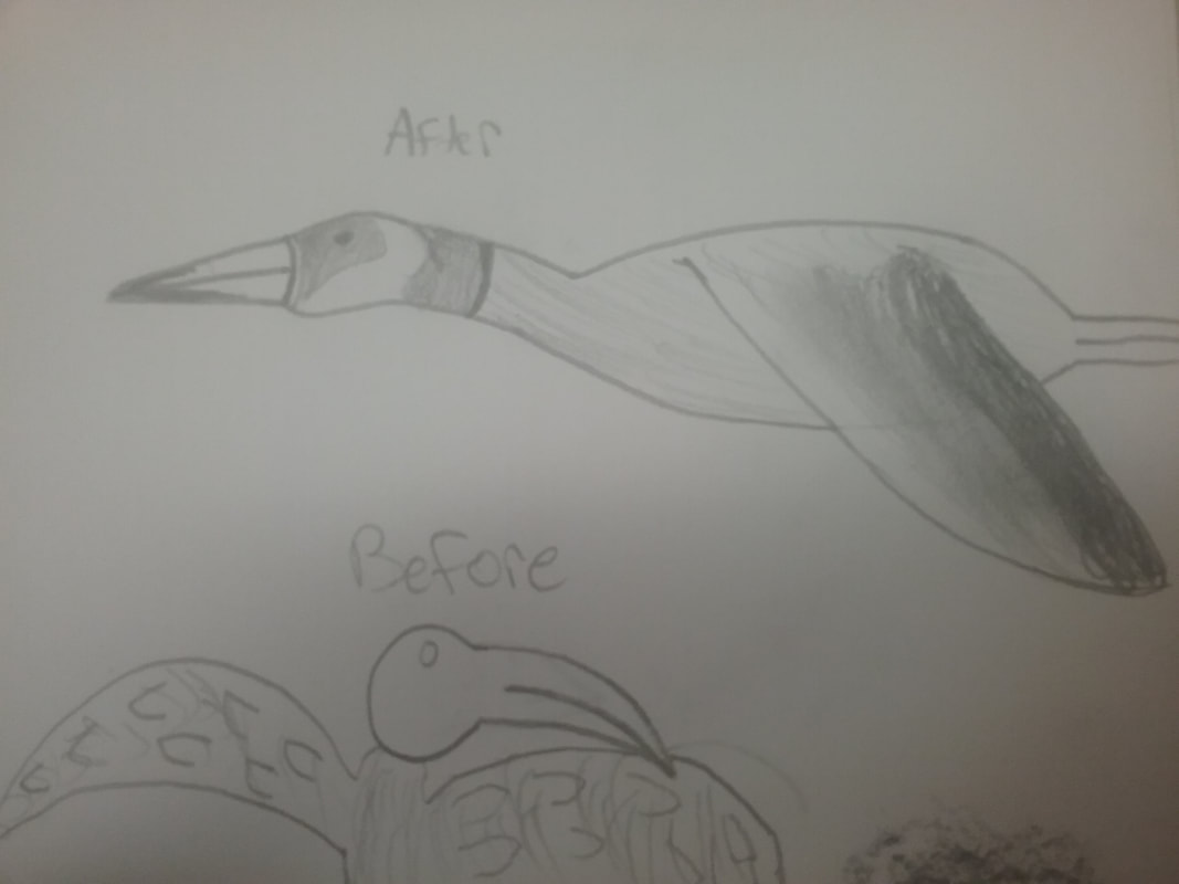
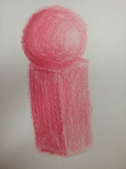
Essay Question 1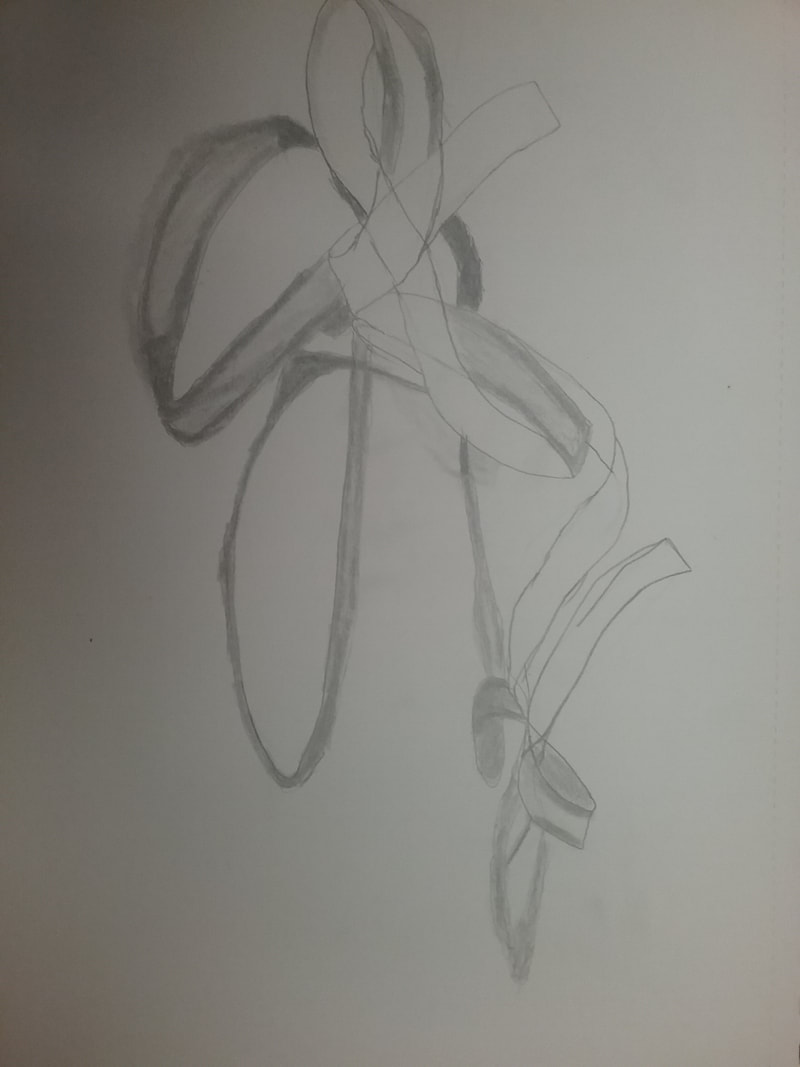 I chose this artwork because it was one of the first pieces I did for this class. It’s a piece on perspective, and was during the “learning phase.” We observed a piece of fabric or string and drew it based on what we saw. I tried to capture the shadow it cast from the overhead lights. Because it was an earlier work, it wasn’t too great, but it still showed that I learned from that whole learning process. It taught me how to look at something, and draw it. The media I used was a normal graphite pencil. 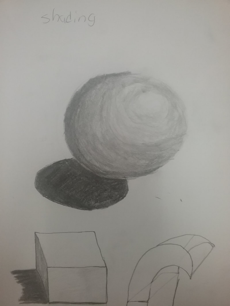 This next artwork was chosen because it was another piece that represented my first days here. It was a learning process on how to draw three dimensional objects and shading them appropriately. You can see that the top of the sphere is white as if light were shining on it and it mixes into a darker color as it goes further down. This shows that I learned how to apply depth and shape into a piece of artwork. 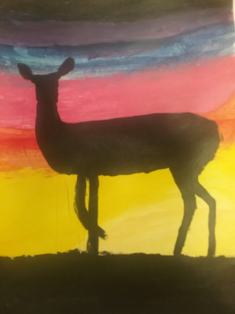 This is where the artwork starts to become more finished. This was a painting of a deer silhouette in the foreground, and very bright and colorful, almost surreal, sky background. This used the blending of paint to make it move smoother between colors. I was a little bit too slow when it came to painting, because before I could blend it in, the paint dried, so I did what I could, and you can kind of see how the yellow fades into the red to make orange, and that into the pink, then blue and purple. 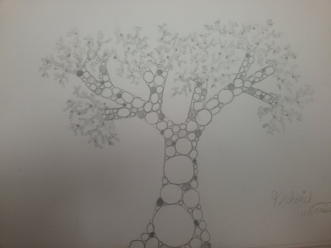 This piece was one of the more recent drawings. It depicts a tree in a pointillism manner, with multiple circles of all sizes in the shape of a tree. I tried to minimize the usage of lines, but it was very difficult to not use lines to fill in with circles. This was made in graphite, and it shows what I’ve learned because it depicts a very different gradient, especially that some of the dots are shaded in, and the shape, although a tree, is very unique. 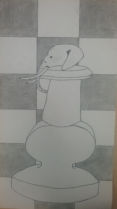 The final piece is of an elephant chess piece. It was made in graphite, and I chose it because it was one of my artworks that had a strong meaning. The art shows an elephant head on top of a chess piece, symbolizing elephants are killed for their ivory, because some chess pieces are made from ivory. After I got done with the main part of it, the chess piece and elephant, I noticed that there was a lot of white space, so I filled it up with a checkerboard pattern, representing chess further. I also added a small amount of red using colored pencil, which red is usually associated with violence, or in this case, blood. This shows that I’ve learned how to create meaning with a piece of art, and fill up unwanted white space. Essay Question 2Out of the five I had chosen for reflection, the elephant chess piece was, by far, my favorite one. This was because it actually had meaning, which sometimes symbolism is more important than how the art looks. On this piece, the meaning was to bring attention to the unwanted poaching of elephants, one of my favorite animals. This wasn't the only symbol in the artwork, but you can barely see that the ends of the tusks are red, and slightly broken off, which means the poaching is cruel and violent. Another thing about this art that I really liked was that I tried to get rid of the plain white background, white space to make it more unique, and enjoyable to look at. Essay Question 3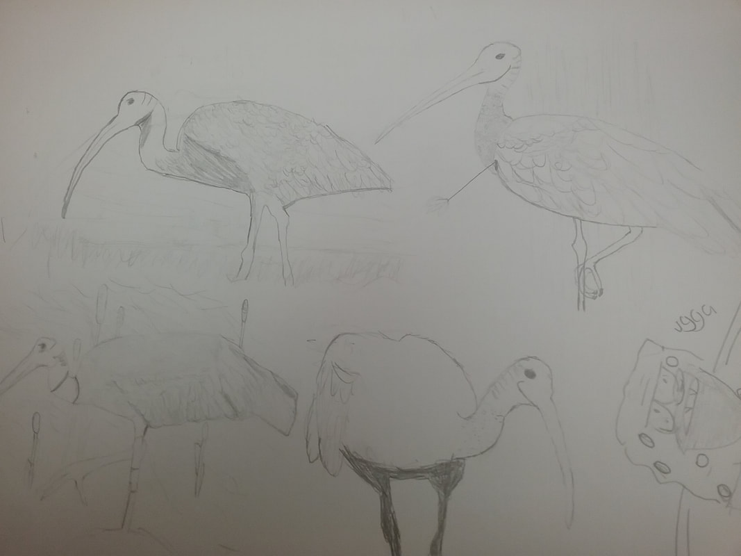 These are my planned pieces for the final project, but I never got enough time of finish the final project. However, these four birds are probably better than ninety percent of my already finished artwork. Even though these birds are technically in the planned stage of the art process, I am very proud of what I created. Especially because… 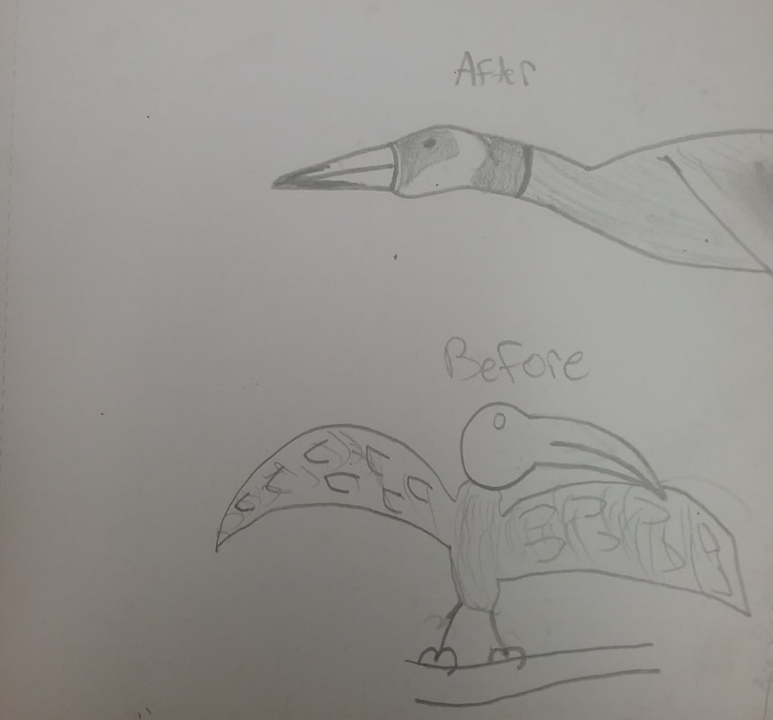 ...this was the very first exercise we did in Art 1, where we were told to draw a bird first from memory, then from looking at birds. Both examples are not very well crafted, and without statement, it shows I've grown as an artist. Back to the final piece. I attempted to get the correct shape down onto the Great Ibis', which are the birds they are representing, and it seems to have turned out very well. I used lots of texture to make it look like the Ibis has feathers and even a bumpy neck, as birds do. There is a small amount of shading when it comes to the head region of the Ibis, to show that the neck is coming out from the neck, and it's not all one large head. In most of the Ibis' backgrounds are cattails and tall grass that are usually found in wetlands. The top right Ibis depicts him or her with an arrow sticking out from its chest, kind of a node to the many pheasant or other bird paintings with arrows sticking out of them, however, mine isn't a pheasant or cardinal, it's a Great Ibis, which would be an original piece of art. To answer the essay questions, I chose this piece because I wanted to really show my progression from the start of the semester to now, and there is clearly improvement when comparing to the earlier birds. Ha. Like stated before, I didn't have time to finish a final piece, so instead this was technically my plan, but I did compose multiple photos of both Ibis' and cattails/tall grass. Essay Question 4I really liked how we could be very free when it came to what we could make, and I really felt welcomed to the art environment. But I felt like there were too little borders, sometimes we would be on a ocean themed art, and people would be working on something completely off topic. It's not bad that the class was loose, but sometimes it was either hard to catch up or very slow. To make it better some way of making time consistent.
0 Comments
I learned how to use a slab and template to make shapes and connect them usimg scoring and slipping to make a 3-D object. I also used some tools, for example the clay sponge to smoothen the clay, and the needle tool to poke holes and score. All the clay peices are in the kiln so no images....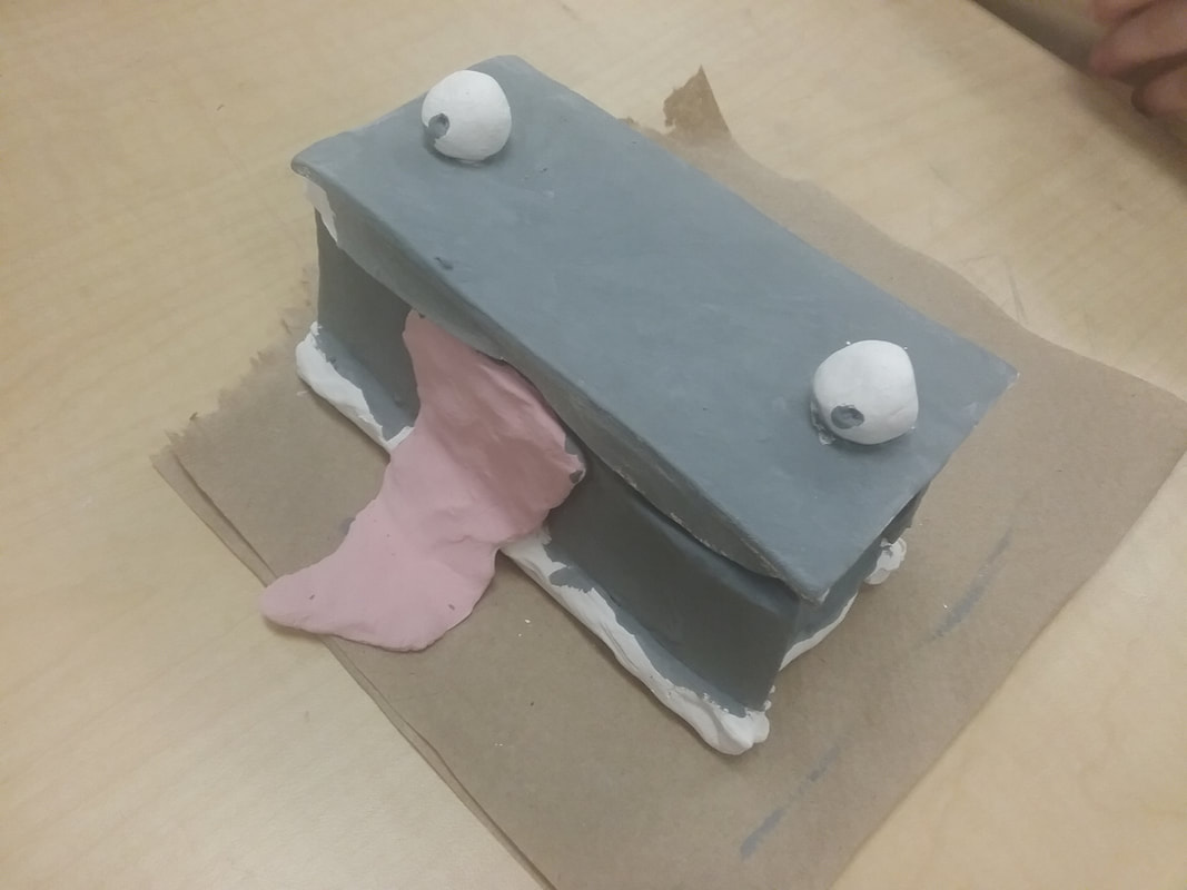 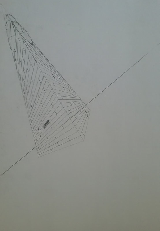 This is a brick clock tower rough drawing. It uses three point perspective and is an optical illusion.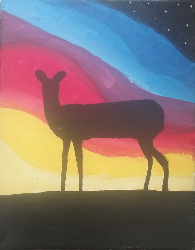 I made my painting by first drawing out some lines to differentiate the colors I would be using to make the background. Then I went in and mixed some cool colors, and left some colors primary. I painted from black with stars, to dark blue, to light blue, to purple, to dark red, to red, to pink, to orange, to yellow, and finally light yellow. I added a second layer which included the main focus of the painting, a deer. I learned how to mix paint to get a desired product, on and off canvas, like in the painting, you see a smooth transition from dark to light blue.
 Here was the first drawing I did in Art. I learned how to combine what I know and observe to create Art. I also learned how to shape a living thing. I needed to work on the shading, as seen, I tried, but it kind of failed.
 This was a sketch I did when I had extra time. I used a layering technique with oil pastel, notice how the three "sides" are all different shades of color. I kind of want to improve where it is placed, because it's a good drawing, but the location isn't really interesting.
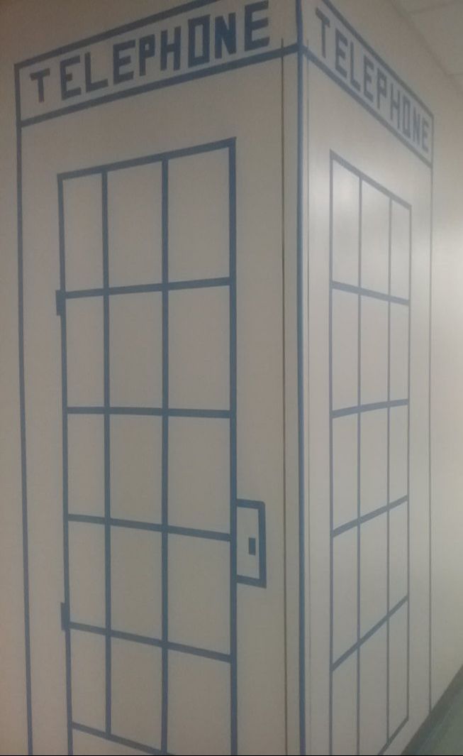 I learned that tape is very useful for art on walls that can't be damaged, but tape itself is not as adhesive as you might expect. We kept having to replace certain parts because they would fall off. Another thing about tape murals is that you expect the artwork to be big, however, no one in our group was very tall, so we had to use stools, which disoriented our vision. Working in a group definitely gets things done faster, and things usually turn out better because everyone can take in what they do best.
|