Question 1
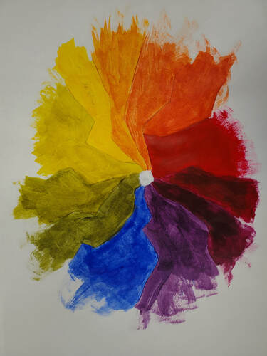
In the beginning I was so focused on making my art straight and linear, especially when working with mediums such as colored pencil, pen and ink, and pastel. One could call this style an attempt at realism, and I was never happy with out those pieces turned out. Towards the end of the course, I realized that being imperfect is okay and to be happy with progress. I can tell that my painting and printmaking is much better than my pastel. When you look at my color wheel, it is not straight and perfect, it is very unorderly and messy looking, an attempt at a more natural or abstract style. Success as an artist is being happy with the work you do, and this may or may not have to do anything with money. One can be an artist for fun, but work as a doctor, or truly be a full time artist. I think the most rewarding part about being an artist is the fact that I can see my own progress. I physically see a difference in my art now and before, and I can display that. The most important skill to make art for me is patience. Especially with my printmaking, that project took a long time, and I went over into the clay unit, but I finished and I am happy with how it turned out. I have learned that I can not really compare myself to others in art, because I am at my level, and I have my own unique style. I have also learned to follow through with what I do, I can not give up an art project because it does not look good, I can not say that until I finish the whole thing.
|
|
Question 2
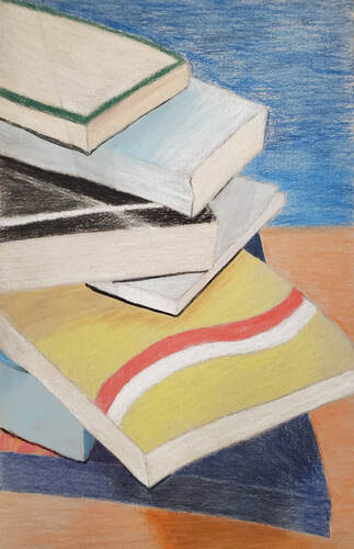
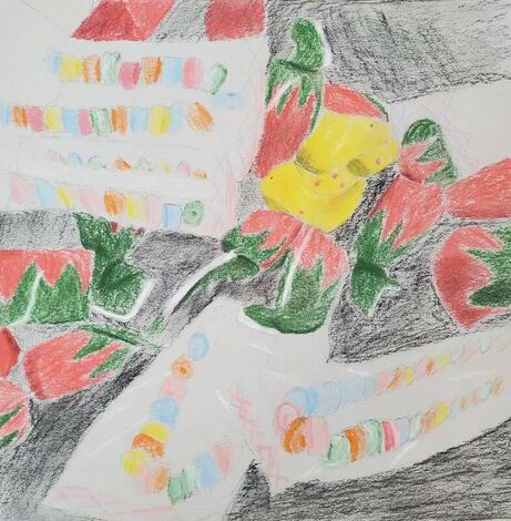
These two pieces depict my growth even though the pieces were created only weeks apart. The candy cluster, the one with red blotches which are supposed to depict strawberries is not even finished. Not only is it not finished, but I do not think it was a successful piece. Then after taking time to reflect and collect my skills, I was able to create the stack of books. The books have much more defined color and very contrasting and orderly colors. It has shading and different levels of foreground. A big reason to why the books are a much different quality than the candy is because I planned the book out much more. I had a colored reference drawing to go back to. I think I was able to see the end product with the book a lot clearer, for example I could not really see how I was supposed to do the candy. In my head the candy seemed like a blob of stuff, and I found it difficult to concentrate. Also, the books were more personal because I took the picture of books I have read in the past that were on my shelf.
|

|
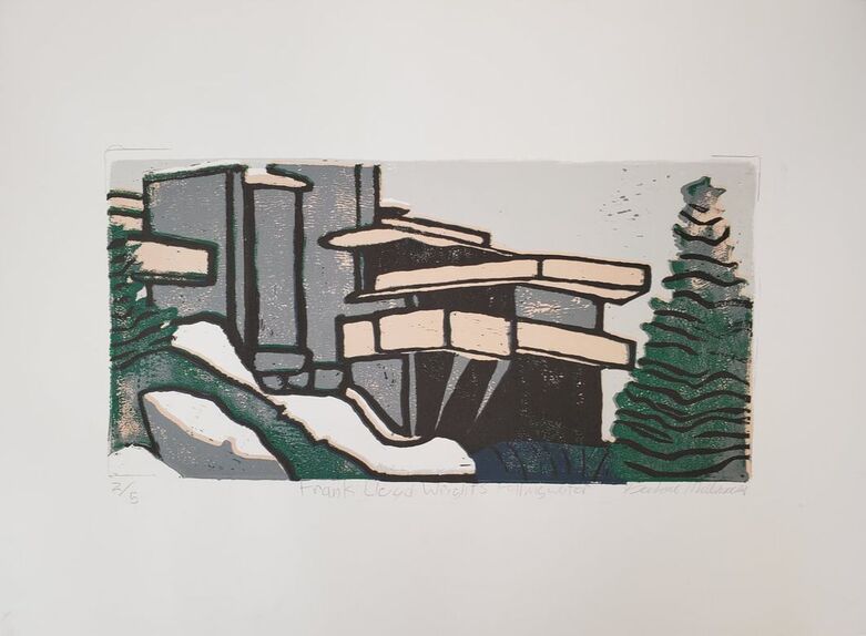
Question 6
My favorite medium to work with was printmaking, specifically the painting and gouging associated with the linoleum block. I also really liked using the gouge to cut away the linoleum, and even though it came out slightly grainy, it was really fun watching the paint build up from the grey background color to the colored work it is now. I was able to master the technique of printmaking because it spanned for a long time, and I had 6 tries to perfect it. Of course, it did not come out perfect, but it looks better than some of my first prints of the same painting. Although, the printing part was only a section of the whole, I think my actual gouging work was good, for example, I did not let the trees be one solid color, I left some linoleum for black. When I first started this project, I did not know how it would turn out because I have never done something like this before.
Question 7
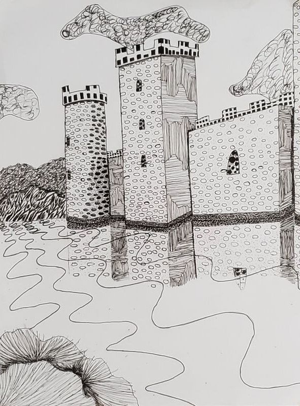
My least successful artwork was my castle and landscape during the pen and ink unit. This unit was the longest too, but I still do not think it was a success. Looking back at it, I remember being frustrated during creation because if I misprinted I could not go back and erase it. The main problem when I look at it now is not the times I messed up, it is the white space. There is too much white space in the background and I could have added some more noise in the foreground. The castle is fine, the surrounding area is what I got wrong. If I could change this piece, I would add mountains into the background so it would not be so boring to look at and remove some of the white space. I could also change the reflection in the water to be more drastic and use a different size pen to indicate the castle is not really there, this would create a more filled up white space and be more interesting to look at.